In this project, I came up with the concept of large backdrop to serve as the focal point for the Summer Welcome Mizzou Fair welcoming new students to campus. During this time, first year students and their families come through to learn about resources and campus departments.
To draw attention to the housing and dining section, my team and I came up with this tagline to communicate Residential Life’s goals of making campus feel like home to students. I chose a series of photos that featured students living, learning and thriving to set a positive tone for the upcoming year. The design met university brand standards, but stood out in a sea of black and gold.
Photos by Sam O’Keefe
Full backdrop design, created in Illustrator using Mizzou Branding elements.
Detail shot of the text treatment.
Conference Materials
There were 5 total print pieces as part of their tabling efforts.
Before the redesign, the client found the flyers uninviting.
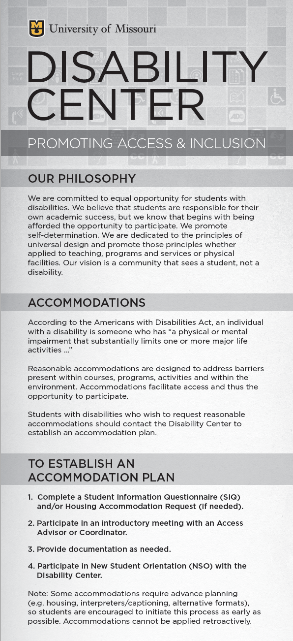
The Disability Center came to us with old marketing materials in need of a refresh. Not only were they created back before the new university brand standards, the old materials weren’t exciting enough for the director. Utilizing the campaign look created by my teammate, Sequoyah Moore, I redesigned the series of materials to stand out – gold paper, easily readable headlines and high contrast. I changed the layouts for several of the pieces to make the most important information more prominent, and I reset the type to fix errors and increase the type size where possible – a serious concern for meeting accessibility for low-vision readers.


